PRODUCT UX
The Overlook
Redesigning the hotel booking experience
ROLE
UX Research
Interaction Design
Prototyping
PROJECT TYPE
Portfolio Project
TOOLS
Figma
Miro
Paper Sketching
DELIVERABLES
Research Synthesis
Journey Map
Interactive Prototype
Developer Annotations

The Overlook is an end-to-end UX redesign project focused on simplifying the hotel booking experience. The project combined user research, affinity mapping, journey mapping, interaction design and high-fidelity prototyping to redesign the reservation flow and improve usability across the entire booking process.


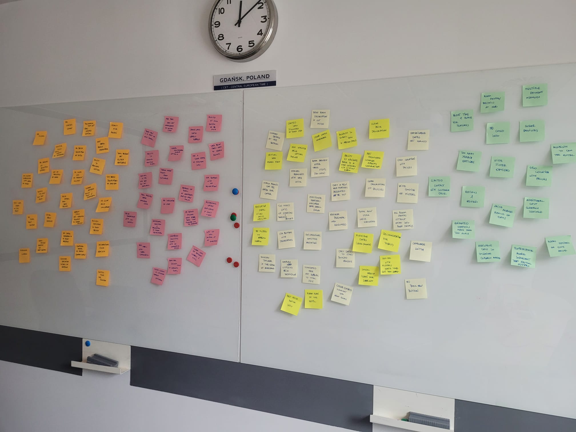
Early affinity mapping workshop used to identify recurring usability issues.
Existing hotel booking platforms often overwhelm users with complex reservation flows, unclear pricing and too many decisions presented at once. The goal of this project was to redesign the booking experience to reduce cognitive load, improve transparency and help users complete reservations with greater confidence.
Pain Points
Too many booking steps
Unclear pricing
Information overload
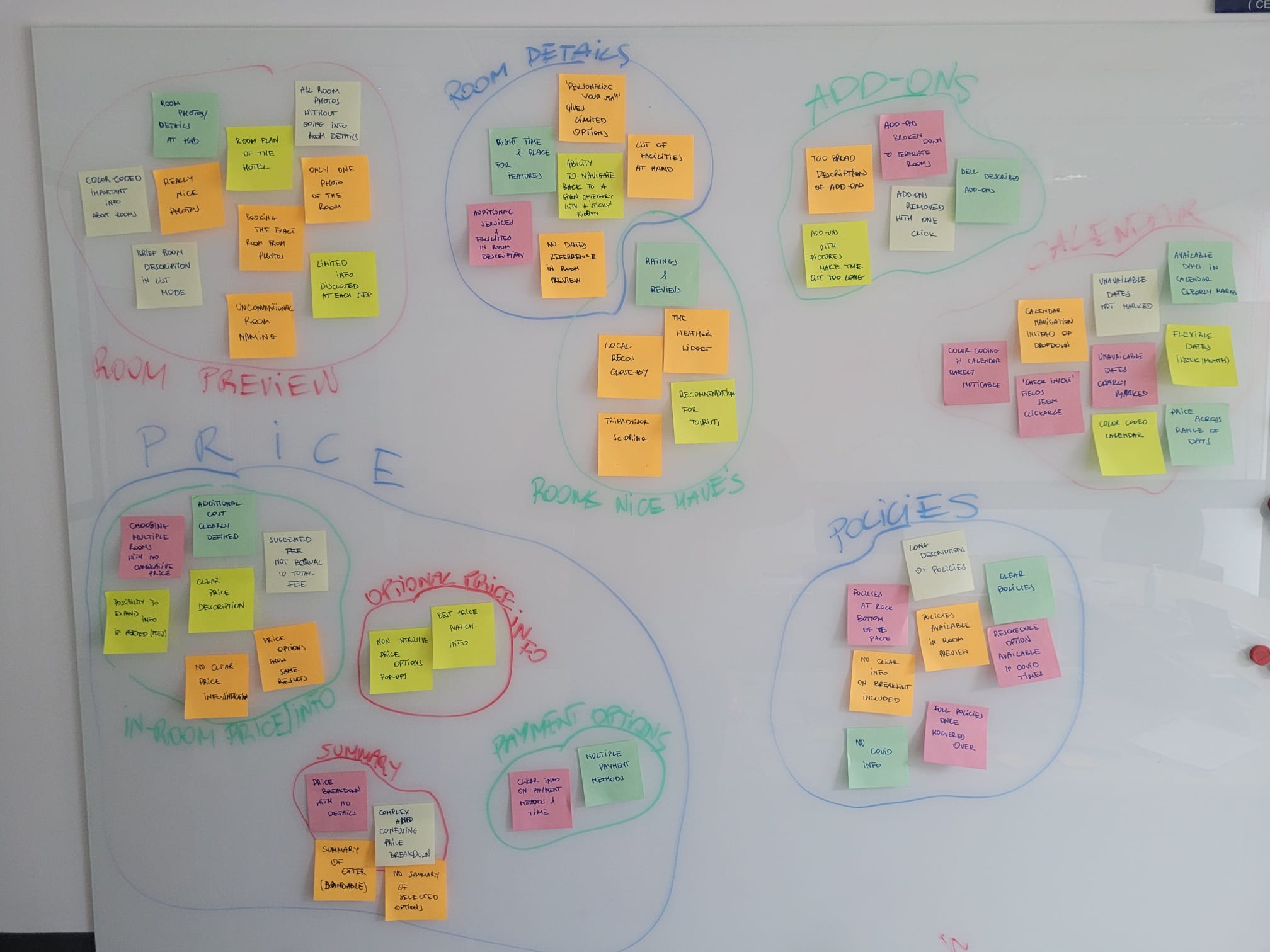
Affinity mapping helped organize recurring usability problems into key themes.
To better understand user needs, I reviewed existing booking experiences, analyzed competitor flows and identified common pain points throughout the reservation journey. The research helped define opportunities for improving clarity, reducing friction and increasing user confidence.
🔍 Competitive Benchmarking
Reviewed booking experiences across multiple hotel websites.
⚡ Surveys and usability testing
Identified usability issues throughout the reservation process.
Grouped observations into recurring usability themes.
Mapped the complete booking experience from discovery to checkout for more structured research

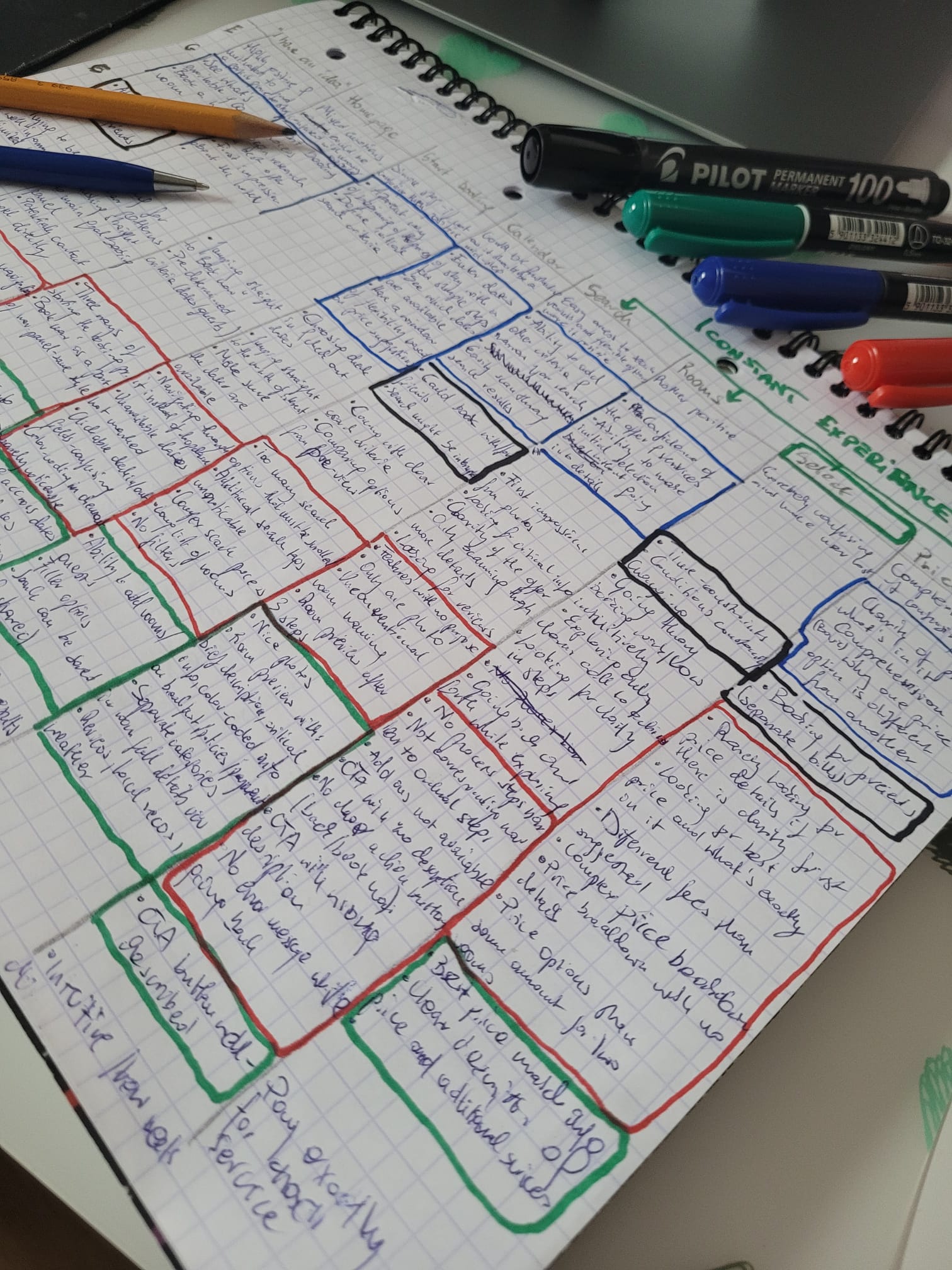
Research findings were synthesized into a Customer Journey Map to visualize user goals, behaviors, pain points and opportunities across the booking process. The map helped identify where users struggled most and guided the redesign decisions.

Key Insights
Transparent pricing
Users wanted to understand the total cost before committing.
Reduce cognitive load
Present only the information needed at each booking stage.
Increase user confidence
Clear room information and policies increased trust.
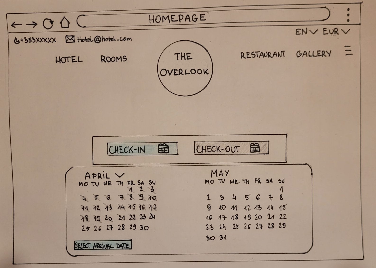
Early wireframes were used to translate research insights into a clearer booking flow. I explored the homepage, room selection, search results, add-ons, and checkout before moving into the interactive prototype.

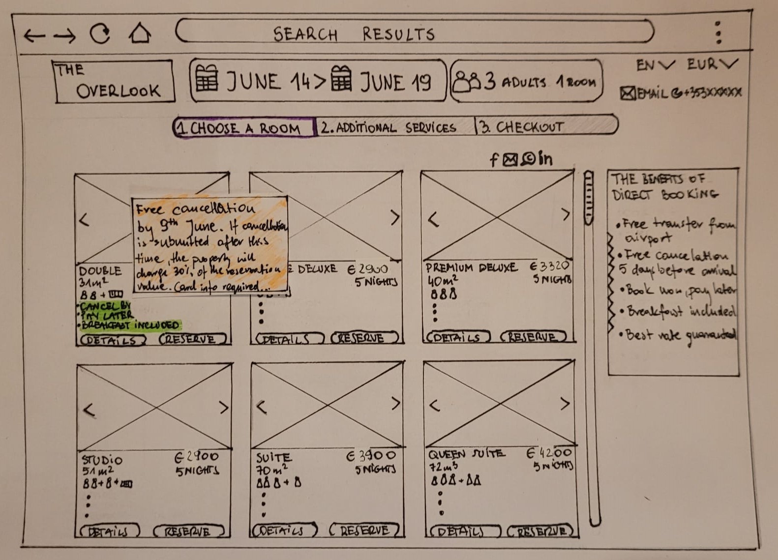
Interaction states and edge cases
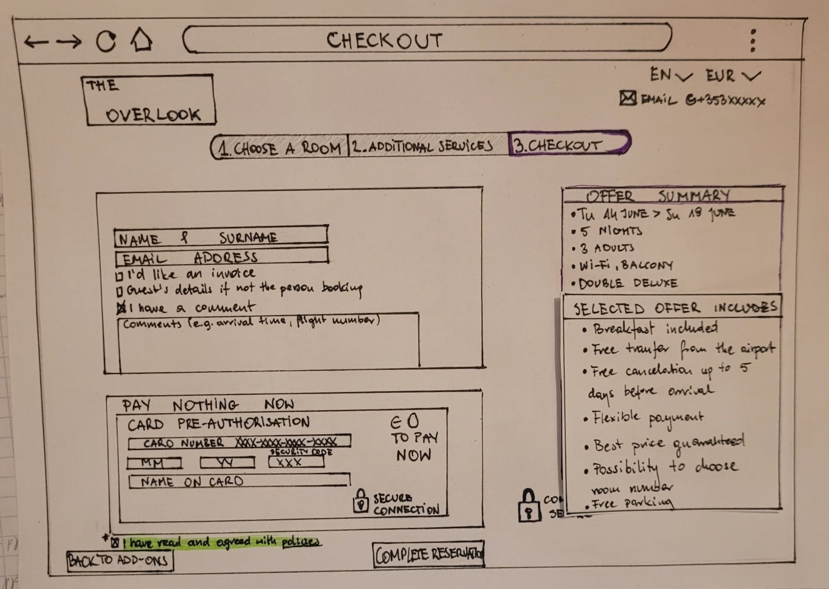
Checkout and payment flow
Based on research insights and wireframe exploration, I created a high-fidelity prototype focusing on clarity, transparency and a streamlined booking experience.

Key Design Improvements


To support implementation, I prepared annotated interface specifications covering interaction behavior, screen states, navigation logic and visual details. The documentation was designed to reduce ambiguity and help developers reproduce the intended experience accurately.

Homepage interaction specifications

Search and room-selection behavior

Checkout states and validation rules
The project produced a complete, research-informed booking experience from initial discovery through checkout, supported by an interactive prototype and detailed implementation documentation.
Research translated into design
Survey findings, usability observations and affinity mapping directly informed the redesigned booking flow.
End-to-end booking experience
The final concept covered date selection, room comparison, add-ons, checkout and booking confirmation.
Implementation-ready documentation
Interaction specifications and annotated screens reduced ambiguity for development handoff.
This project taught me that simplifying any experience is not about removing features — it is about presenting the right information at the right moment.
What I'd improve next
Research-driven decisions
Iterative prototyping
Continuous validation
Conduct moderated usability testing at each stage
Explore accessibility improvements
Validate the final solution with quantitative metrics